SYLLABUS
Creating a Design SYSTEM for Edmodo

Edmodo is a vast product. It spans multiple platforms and multiple user-types. It contains all the functionality of a direct messenger, a full suite of classroom management tools and a full social media network. That is why, when I showed up in 2016 as a product designer, I was shocked to find out that every single interaction, every single component, was created bespoke to its individual context by the company’s single product designer. This led to all sorts of unnecessary and frankly unsustainable issues when building product. Hand-off to engineers was needlessly complex, UI consistency across the product was non-existent, etc.
As designer #2, I decided that my 20% project and lasting legacy would be creating a design system that could at least partially alleviate some of these issues and create a sense of consistency across our product. Starting as a one-man guerrilla offensive, I focused on creating an interactive Sketch library for basic components like buttons and icons for designers to use. The objective was to make a tool that made designing within our system easier than not. I thought that if it was easier to drag a button out of a library, than to draw one from scratch, the system would be adopted. That’s when I realized that I was making a product, and luckily, I happened to be a product designer with a bit of background in designing, you know, products. Also luckily, I had my target users in close proximity and could very easily empathize with their needs. At this point I started approaching the creation of a design system as I would approach building a product.
Over the next year, by working closely with the other product designers, I was able to make a rudimentary design system library that was used within the design department with great success. Designers were able to use the tool to create consistent layouts with consistent elements all by loading pre-existing components. The problem however, was that the counterpart of these componentized elements did not exist on the engineering side. Citing the success of the design system library, I campaigned for a while to get the resources committed for engineers to create their own engineering counterpart to the component library. I found I had a huge amount of support with the front-end engineers in prioritizing this work to be done (turns out, engineers also dislike having to recreate all elements by scratch every single time. Who knew?). The problem was that it could not be formalized and put on a quarterly plan because we had no spare PM’s to scope or manage the project. I volunteered to PM the project. I put a pitch together and ultimately got the project funded for 2019 Q3 and 4 with an ongoing commitment to continue maintaining the system after that.
The Design System as a Product
A design system is a product for internal use with benefits that cascade to the end user. Because it’s still essentially a product, albeit a non-traditional one, the product building process still applies: What problem are we solving and for who? What is our goal and how do we measure success? The answers to those questions are as important as ever, but they may be slightly more complicated than usual because of the product’s waterfall value.
NOTEWORTHY CHALLENGE
Creating a set of tools whose value multiplies as it cascades from designers to engineers to end users.
PROBLEM statement
Design and implementation of the product are inconsistent and time consuming.
PROBLEMS

No System, No Consistency
Every time a product team begins working on or creating a product/feature, they are first tasked with creating the tools with which to solve their problem, before they can actually solve it. Likewise, when engineers build a product/feature, they are first tasked with building their own language and organization system for that project. Any gaps left in the designs are up to an individual engineer to interpret the best they can. Any inconsistencies created by building similar components are absorbed as debt.
No System, No Decisions
A design system isn’t just a tool box of elements, it’s also a collection of practices. Collecting best practices for your product keeps you from duplicating decision making resources the same way an engineering component keeps you from duplicating code.
The Sum is Less Than The Parts
Onboarding Engineers and Designers properly is expensive. Because there is no central repository of patterns and practices, it is almost impossible to educate them about what elements exist and the guidelines for using them. This leads to a long, ill-fated journey wherein a designer or engineer unnecessarily spends huge amounts of time creating their own versions of basic elements that likely already exist AND are almost certain to be inconsistent with the existing versions of that element.
QA Drain
QA-ing duplicate versions of existing elements and patterns is expensive and unnecessary. Using existing, tested components and patterns allows QA and engineering to focus their energy on fixing large bugs rather than small, avoidable ones.
Hand-off Gaps
Lacking a shared language, design and engineering can never be on the same page. A shared system between engineering and design means creating and maintaining a shared language. Speaking the same language means better communication and a closer relationship. A design department that has a close relationship with engineering builds better products.
Lack of Brand Integrity
As a product becomes a family of products, maintaining a level of branding within the family can be a powerful tool. Without any kind of system governing visual assets and styles, it’s very difficult to maintain a brand within just a single product, much more so a family of products.
Lack of Accessibility
Building accessible elements without any standards is at best, ill advised. Maintaining a coherent standard of accessibility across a product this way is impossible. A design system with clear standards of accessibility can institutionalize accessibility into the DNA of a product by ensuring that all elements meet the same standards.
GOALS

There were a couple of tiers of goals for this design system. Obviously, at the highest level the goal was to end up with a functioning design system library for design and engineering that would help address the problems listed above. But, starting from zero and expecting the first iteration of the system to address everything at its 1.0 version would be impractical and arguably impossible. Design systems are products after all, and users’ needs change and evolve and products have to change and evolve with them. Delivering a final and complete design system is more of an asymptotic goal than a concretely achievable one. So what was the goal going to be for this 0.0 to 1.0 stage of work on the design system? Adoption.
Adoption
As a product designer, I had no ability to mandate that the design system be adopted and its standards adhered to. If the system was not voluntarily adopted by a significant portion of designers and engineers, the benefits of having created this system would not outweigh the resources used to make it. I set my sights on adoption as my primary goal metric. After doing a bit of research I hypothesized that the voluntary adoption of a design system revolved around two key concepts: Value and Investment
The design system is a product and its adoption should follow the same rules as a normal product. If it provides its users with immediate value, it’ll likely be adopted. Drag and drop (or copy and paste) elements immediately cuts down time spent designing and engineering for all parties involved. Easy to access single source of truth usage guides for elements also provides immediate value by building confidence and understanding for existing contributors and decreased onboarding time for new contributors. This 1.0 version of the design system would have to deliver on those values right out of the gate.
Another key to adoption is investment. The more a user feels they have a voice in a process, the more they are invested in the outcome of the process. If users can contribute, their personal needs can be better met. As the driver of the design project, I knew I wouldn’t be able to personally maintain the standards that the design system was setting across the design and engineering departments. I would need an invested team to hold each other accountable for maintaining our standards. The trick was getting the ratio right. Too many voices could paralyze progress, too few and progress would be in danger of being too specific and not broadly relevant. In the upcoming process, I knew that it would have to be structured around allowing a great deal of contributions to the system by any interested parties, but with a review system of a relatively small and specialized team.
Measurable product goals
Fewer bugs reported
Reduced page weight
Fewer support tickets submitted
Better adherence to recognized usability standards
General Goals
Better end user usability
Faster production time
Better morale
Faster and better onboarding for new hires
Better communication between design and engineering
Project values
Deliver value first to designers and engineers
Collective ownership
Communication through shared language
Focus on impact
Deliverables
Considering the objectives above, the scope of the 1.0 version of our design system began coming into shape. We would focus on delivering:
Single Source of Truth Component Library for Design
For ease of use, this library would have to exist within the software used in the design process. This ended up being a Sketch library file on the Sketch Cloud. A designer could make changes to the master library file on the cloud and push the changes out to all designers using the library. Elements could be easily drag and dropped from the library into designs and colors and text styles would come pre-loaded in all new files that the user created.
Single Source of Truth Element Documentation for Design
All elements created would also have a usage guide in a central and accessible location. While creating the documentation, the objective should be to provide enough information to allow a brand new hire to begin designing. Writing it in a way that assumed no previous knowledge on the designer’s part would force us to think holistically and better address gaps in our process that may lead to miscommunication. The most accessible location for this documentation was deemed to be an Atlassian Confluence page. Its wiki-like structure was ideal to house the information and allowed all users to submit feedback and questions.
Single Source of Truth Component Library and Documentation for Engineering
Same concept as the component library for design. Engineers needed a central location that would house the reviewed and sanctioned code of all elements. However, some components were built directly into the global CSS, so it wasn’t as much housing those elements, but educating about their existence. This is why housing the elements and the documentation on the same platform was preferable. The engineers chose a product called Storybook.
Process
We don’t really think of process as a deliverable, but it would probably be the most important deliverable of this project. How to decide when an element was “complete,” how to account for the different work tracks on an element, how would feedback be submitted and addressed, etc, all had to have answers bigger than one person. They all had to have an officially sanctioned process so that the project could help govern itself without an executive constantly managing every part.
The Actual Elements
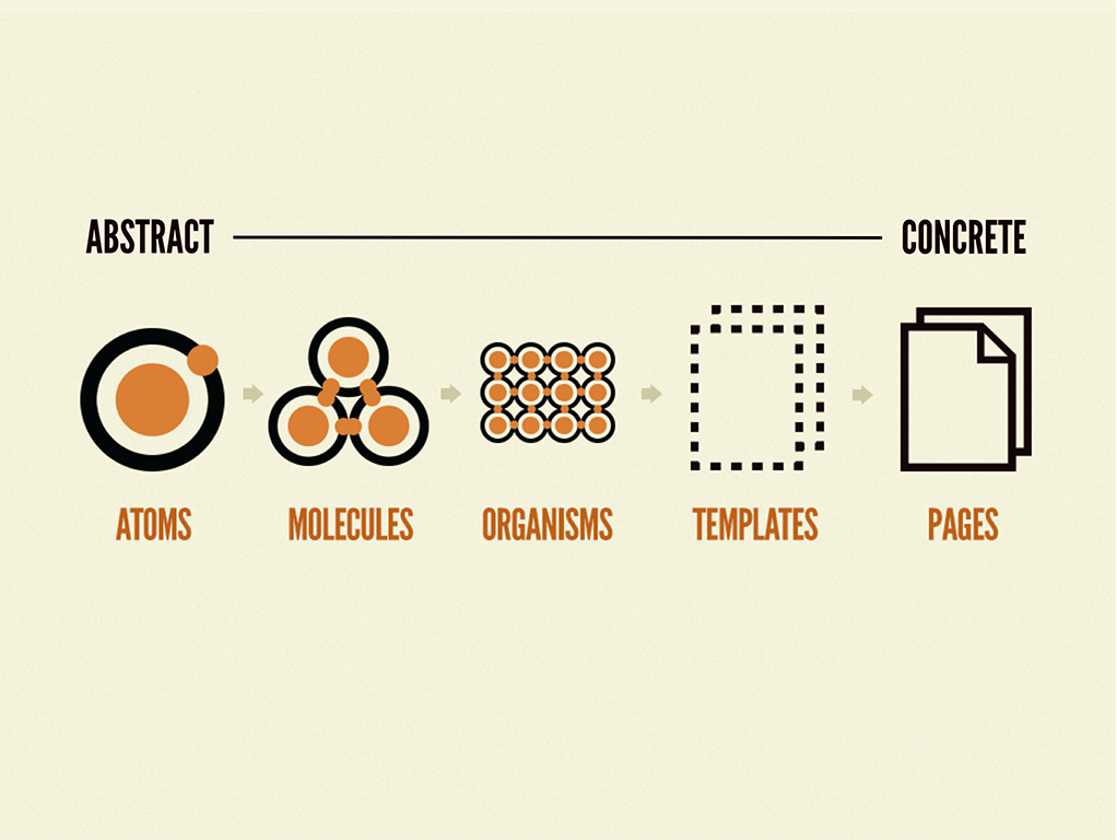
Let us not forget, this was about actually building design components. As stated above, the elements were chosen to deliver the maximum impact and value to designers and engineers working on the product. In the book Atomic Design by Brad Frost, the author splits the elements of a design system into categories based on their reliance on other elements to construct them. ‘Atoms’ are the the most basic elements. Atoms do not contain styled elements, because they ARE the most rudimentary elements of style. ‘Molecules’ are next up, and they are mostly constructed of atoms. A single button is a good example of a molecule: It contains a color, text and possibly an icon. For v1.0 we needed to focus on our atoms and molecules for maximum impact and to give us a good platform to begin building more complex molecules and so forth in the future. Our atomic styleguide would contain Colors, Icons and Typography. Once those were done, we would tackle molecules in the form of Text Fields, Buttons and Additional Inputs (radio buttons, check boxes, sliders, etc).
Deliverable elements in v1.0
Colors
Icons
Typography
Text Fields
Buttons
Additional Inputs
Process

Designing the Design System Project
The process is largely structured within a Jira Project. Epics are just quarterly plans and stories are individual components. Each story has four tasks associated with it, two design and two engineering. Sprints capture what component tasks dedicated designers and engineers are currently working on. The two tasks for both parties are conceptually similar: Create the component and document the component. It is a fairly waterfall process where the design tasks are completed and then the component is handed off to engineers. Using a “date picker” as an example element, let’s walk through the tasks that make up a completed component.
Task 1: Create Component in Design Tools
The dedicated design on the design system project conducts an audit of all places the date picker functionality already exists in product and notes variations in functionality. Design team then meets and explains their current and upcoming needs for the date picker component. Dedicated designer then puts together first pass on component. Design team meets again to review component. Designer at this point also convenes the council of engineers to review the component and submit notes. Notes are submitted and designer alters component until it receives a sign off from the design and engineering councils. Component is handed off to engineers.
Task 2: Document Component (Design)
Designer creates an entry in the design system Confluence wiki detailed all the supported permutations and functionality of new component. Should have enough information for a new designer to be able to be 100% up to speed on a component just by reading the page.
Task 3: Create Engineering Component
Engineers create component and submit it for review to engineering council. Notes are submitted and engineer alters component until it passes engineering review.
Task 4: Document Component (Engineering)
Engineer creates documentation in Storybook. Engineers review and alter until documentation passes review.
When all tasks are marked complete, story is completed and component is ready to be used. This process is pretty straightforward when tasks are approached linearly, but considerations had to be made for non-linear contributions to be supported. Other engineers and designers were eager to contribute to the project, but could not be dedicated to it. Unable to commit to working within a sprint structure, they could begin (and had already been) componentizing elements within features they were building. Obviously, if a date picker element, for example, showed up on an engineer’s sprint for the week, they wouldn’t be able to wait for a fully vetted date picker component from design. So engineers could, at their own discretion, decide that they would build an element of a feature they were tasked with coding in a way that lent itself to componentization. Then, they would be able to flag that component as an element that was in a partial state of componentization. In the project, they would make a new story called ‘Component: Date Picker,’ again for example, complete with the four subtasks mentioned earlier. They would then mark the engineering task for creating the component as “in progress,” or “complete” depending on the completeness of their componentization. The story would then be added to the backlog. As the design system gained traction and visibility, more designers and engineers could provide meaningful help by picking tasks in the backlog to complete that would bring a partially finished component to its fully “done” state.
Outcomes
Maintaining an open contribution system allowed us to meet and exceed our quarterly goals. But, more importantly, I’d like to think it helped us generate a lot of support for the system. Designers and Engineers were excited to contribute in their own ways on their own time instead of having to submit to being assigned to something they may not be interested in. On the same page, this helped generate a lot of interest and investment by creating a loose structure that allowed people to contribute with a sort of “passion project” energy without having to bear any burden of managing the effort. Overall a pretty satisfying spiritual outcome.
More concretely though, page weight was already starting to lower. In some cases, the CSS was being reduced by 70%, and those were just early numbers. As the project continues and more elements are componentized, it’s reasonable to assume that it will only continue and increase.
Almost immediately, components were beginning to be adopted on engineering and are 100% adopted on the design team.
Problem
The standard waterflow process (design works on component, hands off to engineers) for this project does not support ad hoc engineering work.
Goal
Create a system that allows open contribution to the design system.

Excerpt of design documentation on ‘Colors.’
